Peach Aviation Redesign
This project focuses on redesigning the official website of Peach Aviation to enhance both the user interface (UI) and user experience (UX). The goal was to polish the visual design while improving the overall usability and user flow for a more seamless booking experience.
Product Design
Figma
Product Redesign
Booking a flight should spark excitement, not friction.
Most of the airline company design their product to be efficient and usable, but a great product doesn't have to compromise between visual and functional. A great product does not have to come at the expense of the other.
Peach Aviation has a functional site, it does the job well, but there are a lot of design and UX aspects that can be improved.
Where the Experience Breaks
Peach Aviation has a strong brand identity — playful, youthful, approachable. But spend a few minutes on their website and something feels off. The energy of the brand doesn't quite translate into the experience of using it.
The most immediate issue is hierarchy. The homepage is dominated by a large carousel ad banner, pushing the flight search widget — the single most important action on any airline website — below the fold. A user's first instinct when landing on an airline site is to search for a flight, and the current layout works against that instinct from the very first scroll.
Navigating deeper reveals more friction. The visual language feels caught between two eras — brand colors applied inconsistently, typography sizing that varies without a clear system, and a layout that leaves large areas of empty, unintentional space. Compared to peers like Tigerair who've built confident, cohesive design systems, Peach's web presence feels like it hasn't fully committed to its own identity. That gap became the core motivation for this redesign.
Working Backwards from the Right Questions
The competitive audit was a useful anchor. Jetstar and Tigerair both lead with flight search prominently above the fold — no ambiguity about what the page is for. A more high-end airline like Starlux pushed the bar further on visual cohesion, showing how an airline site can feel premium and purposeful without sacrificing usability. The through-line across all of them: clarity of intent on every page. That became the lens for every decision in this redesign.
With Peach's brand colors locked in, the challenge wasn't reinvention — it was discipline. The magenta and white palette is strong, but the existing site dilutes it with inconsistent application. The redesign treats the brand color as a deliberate tool: used purposefully for primary actions and key moments, not scattered across the page. Spacing was tightened into a consistent grid, turning those awkward empty areas into structured breathing room that actually guides the eye rather than losing it.
The booking flow presented a different kind of problem. The content itself wasn't wrong — the steps were all there — but each screen carried too much visual noise, making users work harder than necessary to complete a simple task. Rather than restructuring the flow entirely, I kept the same step sequence but stripped each screen back to its essentials: cleaner labels, reduced clutter and scrolling neccessity, and a clearer sense of progress from one step to the next.
Before & After: The Redesign
Each comparison below shows the original Peach Aviation interface alongside the redesigned concept, walking through the key changes made at every stage of the user journey.
01 — Homepage The carousel ad banner that previously dominated the hero area has been replaced by a full-bleed background image and a flight search widget, putting the most important action front and centre. Promotional content still exists, but is repositioned lower in the hierarchy where it supports — rather than competes with — the user's primary goal.
02 — Flight Results Page The original design used a stacked card layout, forcing users to scroll extensively just to compare available flights — a significant friction point during one of the most critical steps in the booking process. The redesign shifts to a condensed list view with clear typographic hierarchy, so all options are visible and comparable without unnecessary scrolling.
03 — Fare Options Overlay The original design displayed all fare variations inline on the same page, differentiated only by color — visually noisy and hard to compare at a glance. Renaming it and rethinking its format, the redesign introduces an overlay approach that isolates fare selection from the rest of the UI, presenting each tier in a focused, decluttered context that makes the differences between options immediately clear.
04 — Traveller Information Page Several friction points were identified and removed: the prominent red required field labels that disrupted visual flow, the address section which adds unnecessary steps for a typical booking, and an inconsistent field layout that made the form feel longer than it needed to be. The redesign reorganizes the remaining fields into clearly grouped sections, creating a calmer, more logical form experience from top to bottom.
05 — Baggage Selection Page Despite being a straightforward choice, the original page used a stacked layout that made a simple decision feel unnecessarily laborious. The redesign flattens this into a compact, scannable format where all options are visible at once — making selection fast, clear, and proportionate to the actual complexity of the task.
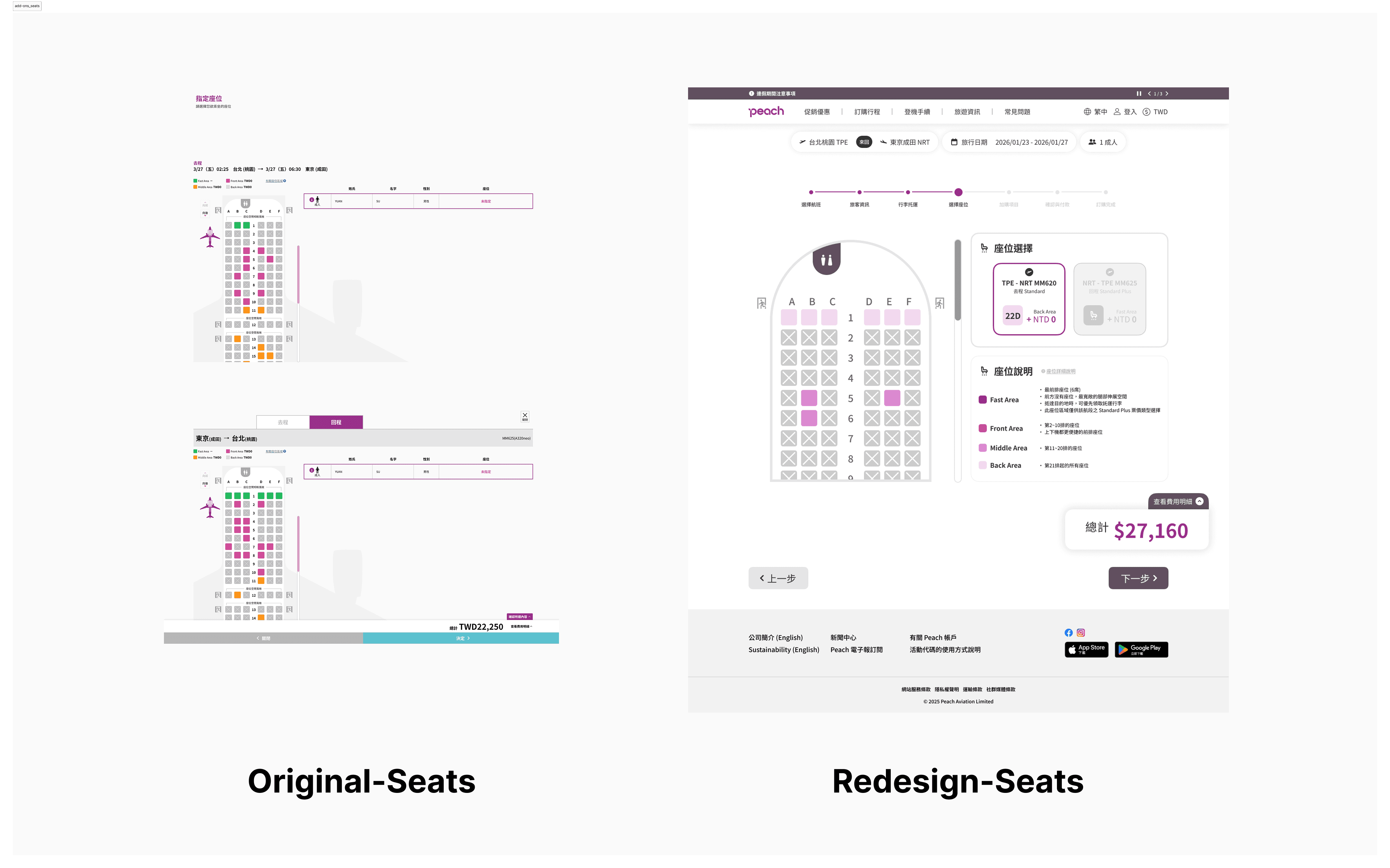
06 — Seat Selection Page The original layout duplicated the full seat map for both outbound and inbound flights, creating a repetitive and scroll-heavy experience. The redesign consolidates both into a single unified view, with outbound and inbound selections handled through a compact card toggle — reducing the page length significantly while keeping both choices accessible and clear.
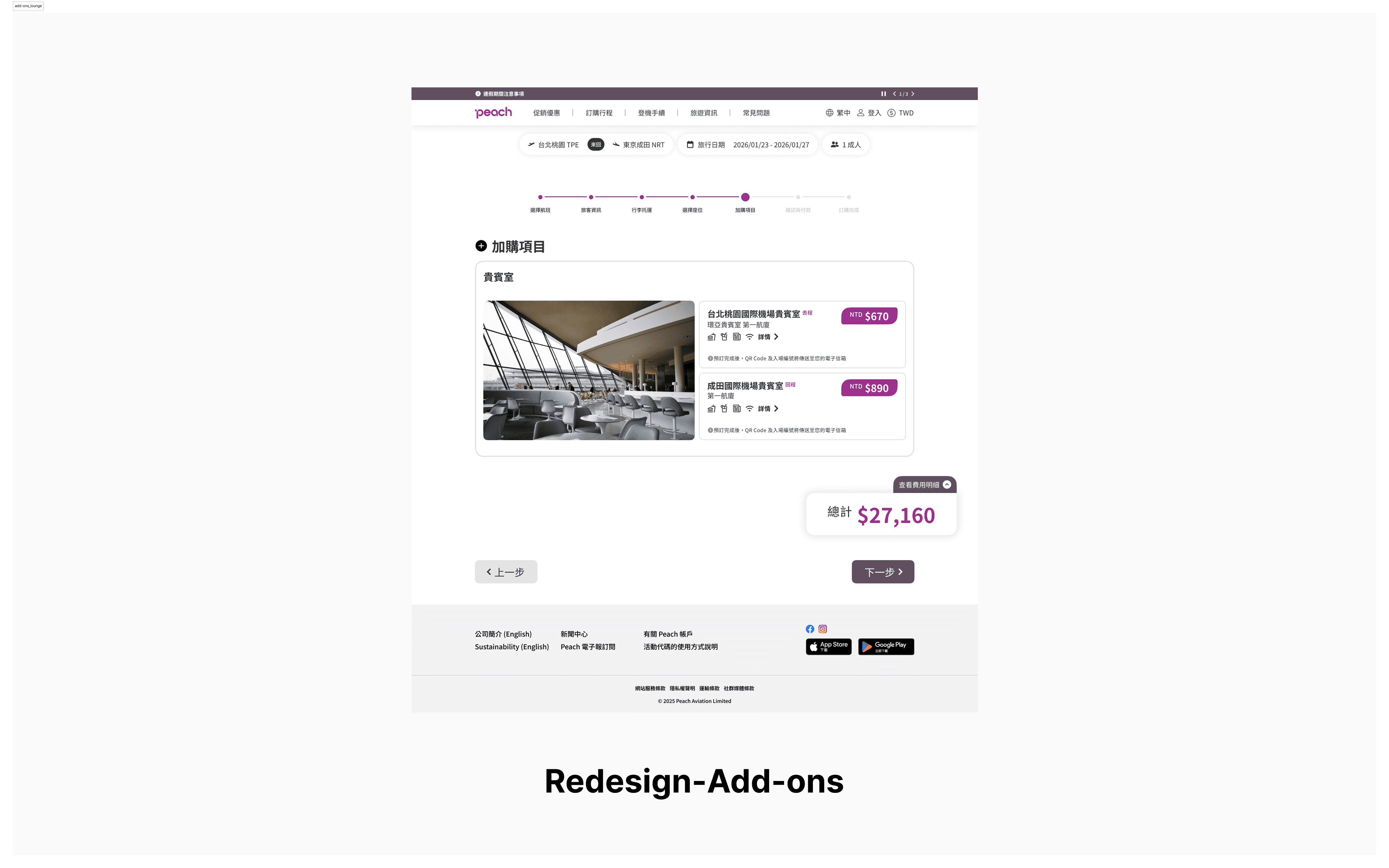
07 — Add-ons: VIP Lounge This section was conceived entirely from scratch, as the original design had no lounge offering. The redesign introduces a card-based layout with a lounge preview photo on the left giving users an immediate sense of the experience, and stacked outbound and inbound selection on the right. The result is a clean, visually engaging presentation that makes a premium add-on feel considered and desirable rather than tacked on.
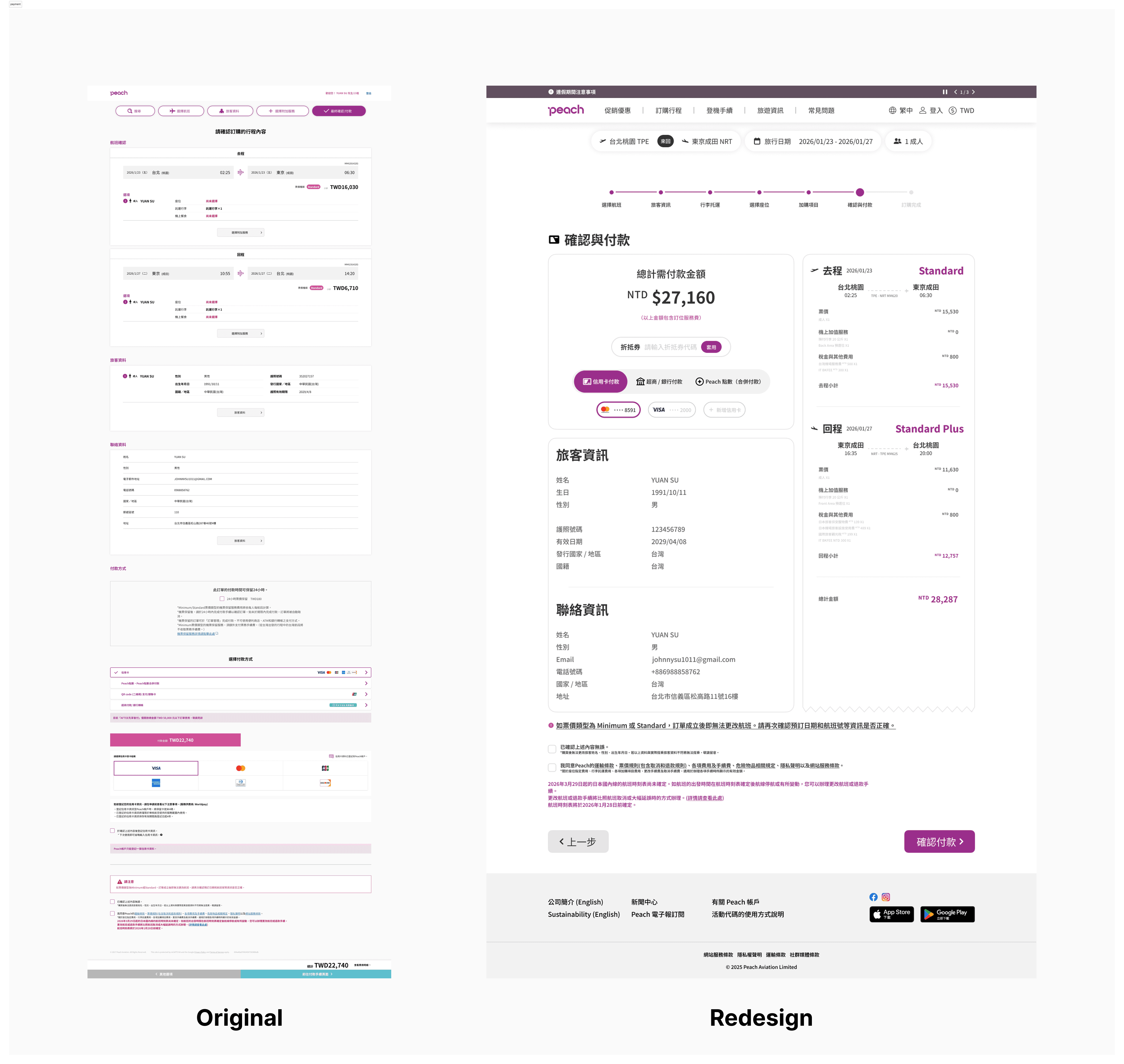
08 — Payment Page The original payment page followed the same stacked layout pattern, resulting in a page far longer than the task warranted. The redesign consolidates the layout and streamlines the payment options down to the three most-used methods, removing rarely used alternatives that added visual clutter without meaningfully serving most users.
Visual Design

What I'd Do Differently (And What's Next)
This project pushed me to think about UX flow not just as a sequence of screens, but as a cumulative experience — where friction in one step carries forward and compounds into the next. The stacked layout pattern repeated throughout Peach's original booking flow wasn't just an aesthetic issue; it was a usability one, and recognising that distinction sharpened how I approach design audits. It also reinforced how much visual consistency matters as a trust signal — when a UI feels coherent, users move through it with more confidence.
Working within Peach's existing brand constraints was its own kind of creative challenge. The instinct when redesigning is often to start fresh, but keeping the colour palette locked meant finding improvement through discipline rather than reinvention — tightening the system, not replacing it. That balance between making something feel noticeably better while keeping it unmistakably the same brand is something I'd carry into any future client-facing work.
If this redesign were to move forward, the natural next step would be extending the same process to Peach's mobile app. Rather than simply adapting the desktop redesign to a smaller screen, I'd approach it as its own dedicated project — conducting a fresh audit of the existing app, benchmarking against airline apps from competitors, and identifying the friction points specific to a mobile booking context. Good mobile design has its own set of rules, and it deserves the same level of analytical rigor that drove the decisions here. In parallel, I'd build out a fully interactive Figma prototype of the desktop redesign to run user testing — particularly around the overlay fare selection and the consolidated seat map, where assumptions that feel intuitive in design don't always hold up when real users interact with them. That feedback loop is where a redesign concept truly becomes a finished product, and the learnings from it would directly inform how the mobile work is approached.